Using Responsive Design
Note
In CODESYS Visualization version 4.7.0.0 and higher, you can design responsive visualizations.
A responsive design automatically adapts to the size and layout of the display variant. Whether the device is a desktop, a laptop, a tablet, a panel, or a smartphone, the specifications of the respective device are taken into account and the size and layout of the visualization are adapted.
In order to provide this convenient feature to the visualization user, you need to configure the display variants and the visualization elements depending on the client size. This is relevant for the web visualization because there are different client sizes here. However, the feature can be used in the same way for the target visualization.

Responsive design is particularly suitable for the web visualization. However, the configuration settings also need to be made for the target visualization or the integrated visualization.
Under the Visualization Manager, open the WebVisu object.
Specify the scaling type.
Select the Fixed scaling option.
And select the Use automatically detected client size option.
With the Fixed scaling type, the contents of the visualization object (main page) are displayed unscaled. The display size is determined automatically.
The
Containervariable is recognized in the project.Now you can configure the visualization elements as described below to make sure that they are displayed moved or resized depending on the client.
Or select one of the scaling options, Isotropic or Anisotropic.
In the device tree, open the Visualization Manager.
The Responsive visualization size option is located on the Settings tab in the Additional Settings group.
Select the option.
The "responsive visualization" feature is activated in the entire application.
With the Isotropic and Anisotropic scaling types, the full contents of a main page is scaled to the display size provided by the client. The client size is detected automatically.
Now you can configure the visualization elements as described below to make sure that they are displayed positioned or resized depending on the client.
Access to the client size
To access the size of the current visualization, the variables Visu.Width and Visu.Height can be inserted in expressions. To access the size of the current container, the variables Container.Width and Container.Height can be inserted in expressions.
To determine the total size of the client in a deeply structured visualization, the variables VisuElems.CurrentClient.Width and VisuElems.CurrentClient.Height can be inserted in expressions. Then you can specify these expressions in the properties of visualization elements.
This makes it possible to access the total size of a client in a deeply structured visualization. For example, you can decide on portrait or landscape format.
For more information, see: Optimally Adjusting the Position and Size
Using the "Fixed" scaling type
With the Fixed scaling type, the contents of the visualization are displayed unscaled. However, the elements are moved or resized depending on the client if they are configured as described below.
To do this, configure as follows:
Absolute movement, Movement, X:
Container.Width - Visu.Width
This is possible with the Trend, Trace or Cartesian XY Chart elements.
To do this, configure as follows:
Relative movement, Movement bottom-right, X:
Container.Width - Visu.WidthRelative movement, Movement bottom-right, Y:
Container.Height- Visu.Height
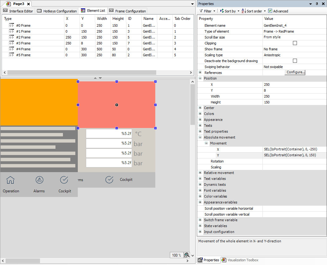
To do this, configure as follows:
Absolute movement, Movement, X:
SEL(IsPortrait(Container), 0, -250)Absolute movement, Movement, Y:
SEL(IsPortrait(Container), 0, 150)
The Invisible element property enables the display of many different elements for the different client sizes.
To do this, configure as follows:
State variables, Invisible:
IsPortrait(Container)
Using the "Isotropic" or "Anisotropic" scaling type
With the "isotropic" and "anisotropic" scaling types, the full contents of a main page is scaled to the display size provided by the client. If the page orientation of a tablet, for example, is rotated from landscape to portrait, then the contents do not match the aspect ratio. Large bars are created and the page cannot be filled optimally.
In order to avoid this, it was previously necessary to create a separate page (visualization) for each of the portrait and landscape formats. These are started via the ClientListener with the correct starting page. Now this can be achieved more easily via responsive resizing without having to duplicate the visualization objects.
With responsive resizing from landscape to portrait format, tiles which are farther to the right side are moved to the bottom right by an absolute movement. The current page size adapts dynamically to the current client size and the elements are optimally positioned within it. When changing from portrait to landscape format, the elements are moved in the opposite direction.
The main page of a visualization consists of several "tiles" which are programmed with frame elements. These frame elements must be repositioned and moved if the orientation of the visualization changes and they are adapted to the current display size.
Configure as follows:
Property: Absolute movement, Movement, X:
SEL(IsPortrait(Container), 0, -250)Property: Absolute movement, Movement, Y:
SEL(IsPortrait(Container), 0, 150)
Implementation of IsPortrait for determining the visualization size
FUNCTION IsPortrait : BOOL
    VAR_INPUT    sizeProvider : VisuElems.ISizeProvider;
END_VAR
IF sizeProvider.Width < sizeProvider.Height THEN
    IsPortrait := TRUE;
END_IF
Calculation of the movement in the X and Y direction with typical expressions under the Absolute movement property: